Who owns America’s industrial emissions.
Fourteen years of the EPA Greenhouse Gas Reporting Program, reconciled at the parent-company level. 8,106 facilities, 3,327 parents, and a consolidation pattern that follows the Gulf Coast pipeline grid.
Why this matters
In September 2025, the EPA proposed removing 46 of 47 source categories from the Greenhouse Gas Reporting Program, the program that produced this dataset. The comment period is open as of this writing. What follows is a map of what we would stop being able to see: fourteen reporting years in which the industries the program measures compounded into fewer hands, more facilities, and wider population reach. The case for the instrument is written in its own record.
The Numbers
The Figures
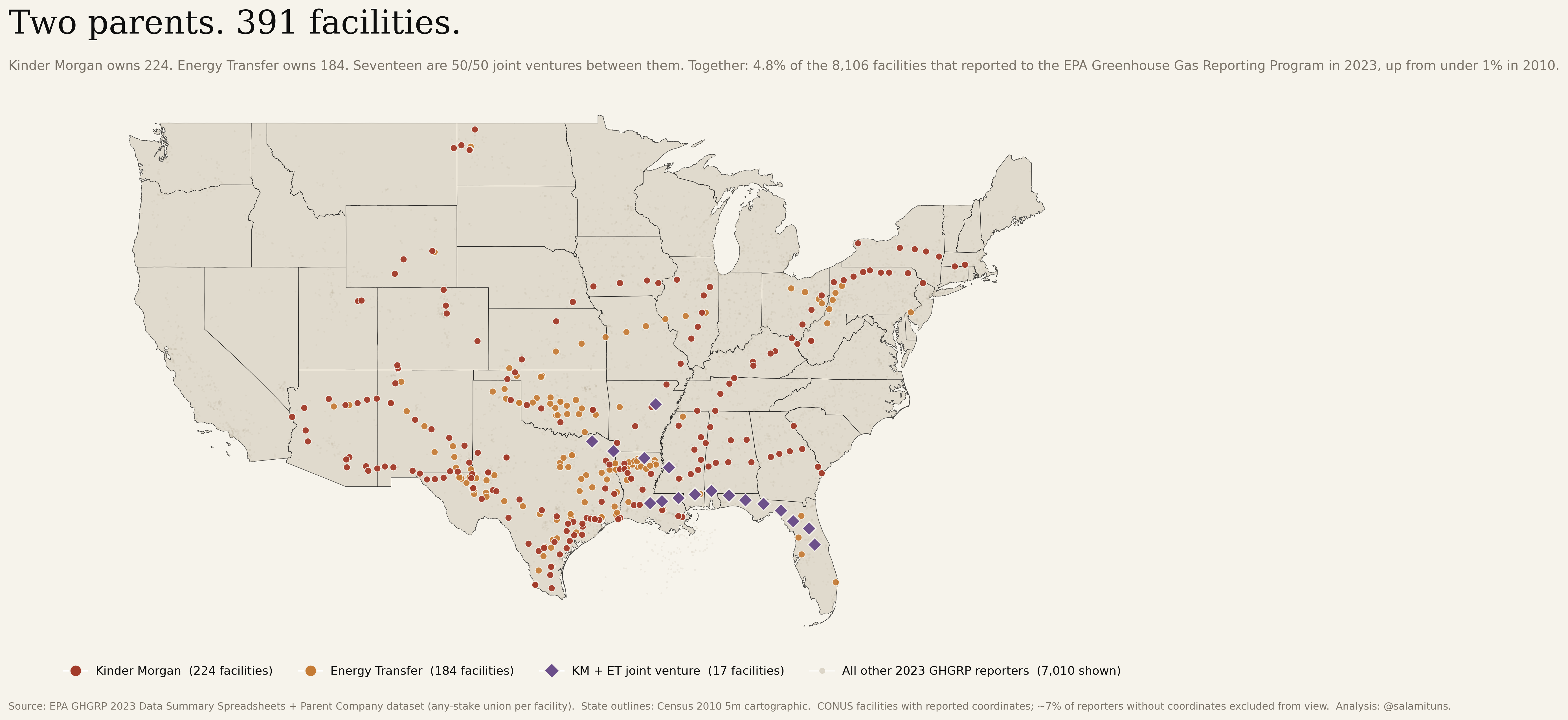
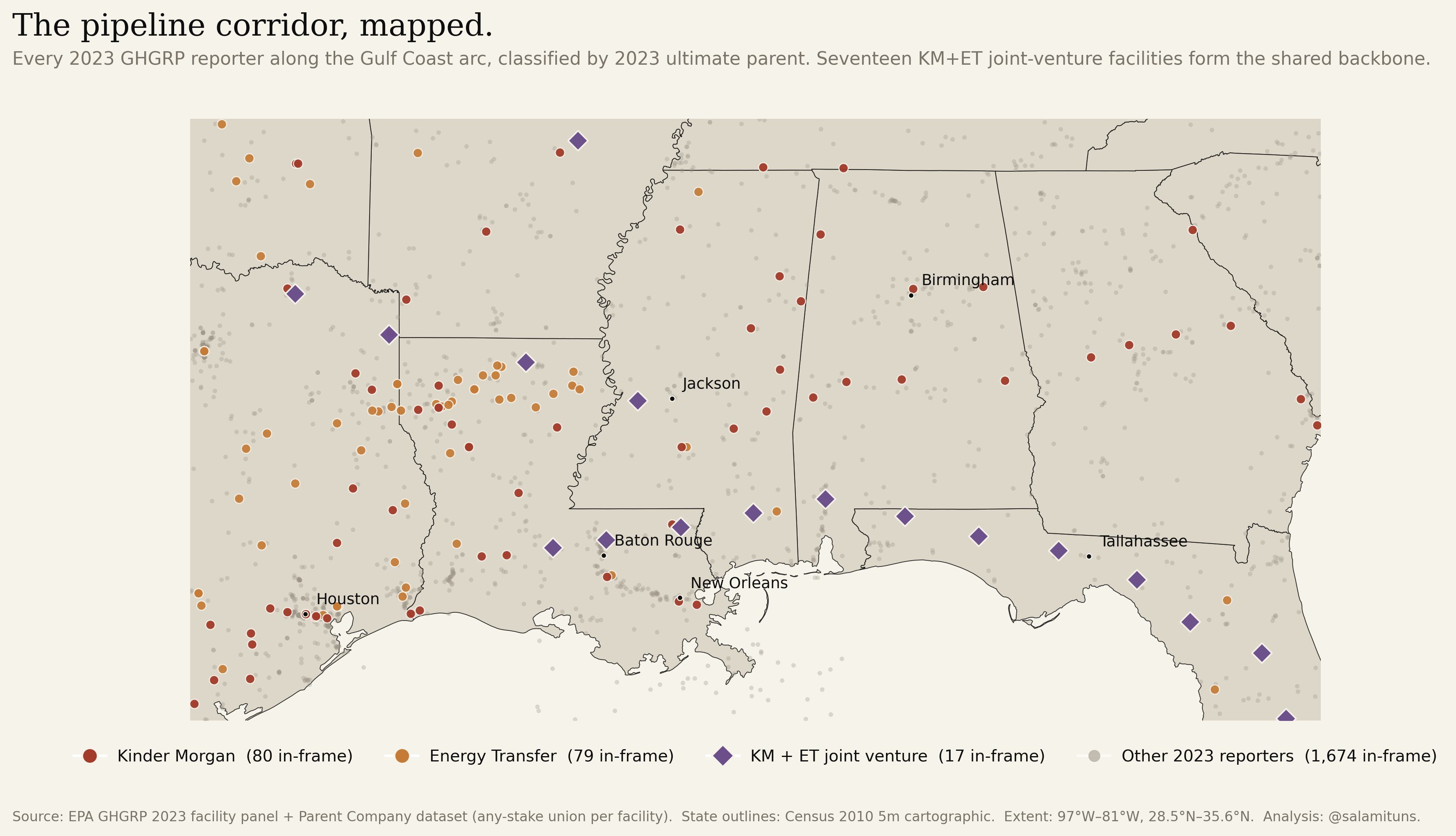
Two parents, 391 facilities.
The thesis of the piece, in one image. Kinder Morgan’s 224 facilities and Energy Transfer’s 184, mapped on a single frame. Seventeen are 50/50 joint ventures between the two and are counted once. Together: 4.8% of the 8,106 facilities that reported to the EPA Greenhouse Gas Reporting Program in 2023, up from under 1% in 2010. Shown against a ghost layer of every other reporting facility so the two networks read as distinct shapes: the Kinder Morgan pipeline lattice coast-to-coast, Energy Transfer denser through the South and Midcontinent, the JV cluster in Florida.
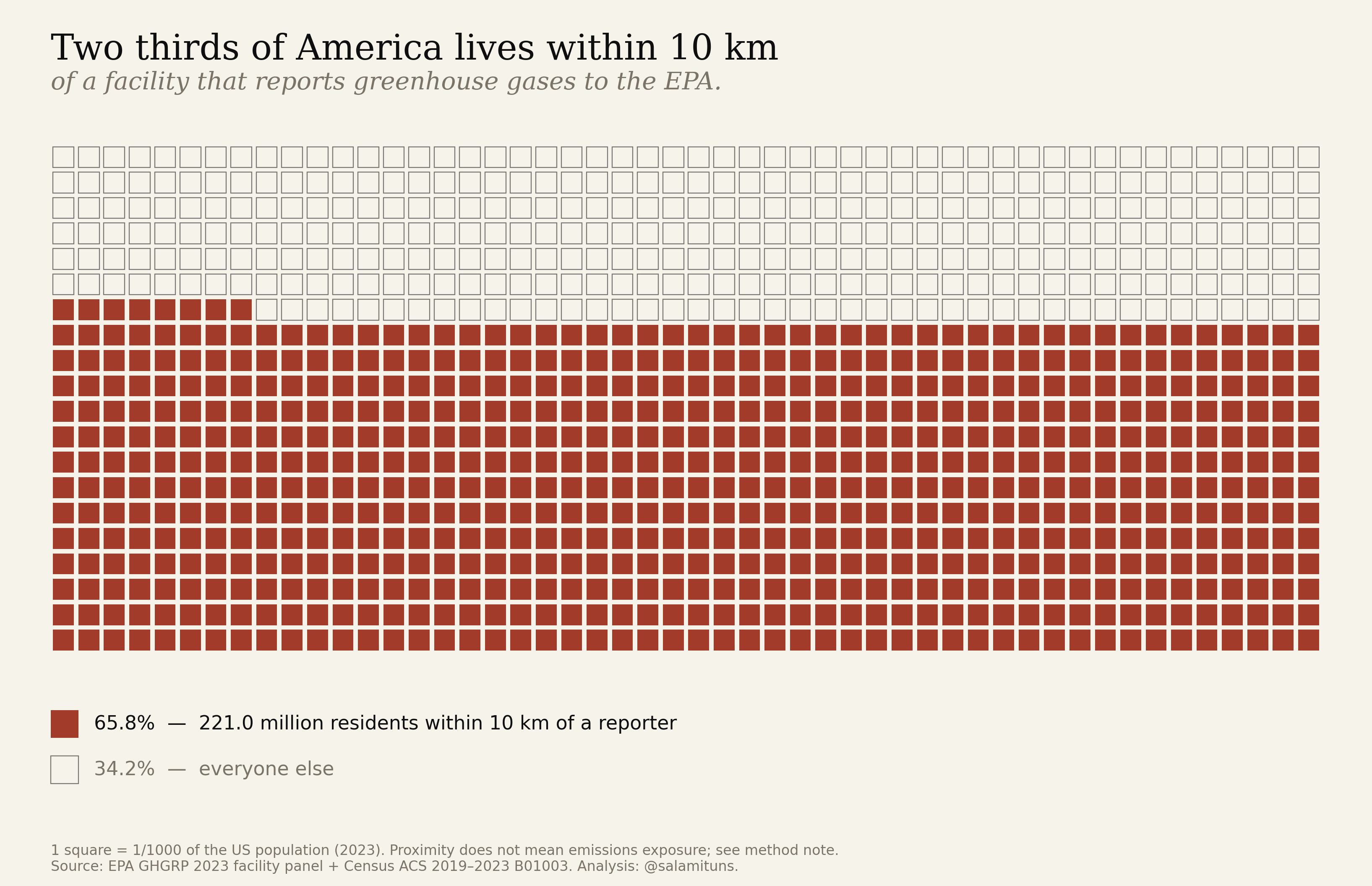
Two thirds of America.
One thousand squares, each one a thousandth of the country. 658 of them (221 million residents) live within 10 km of a facility that files a greenhouse-gas report with the EPA. Proximity is not exposure; it is the measure of how thoroughly industry shares the neighbourhood with the population.
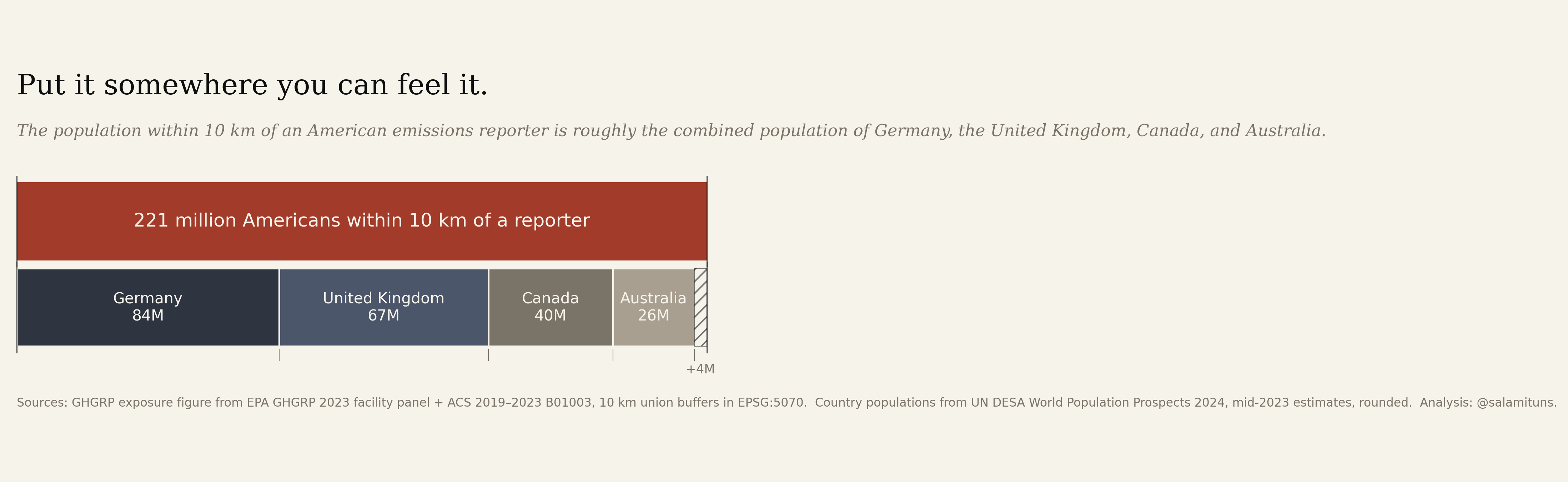
Germany, the UK, Canada, and Australia.
Same two-thirds, in places you already know. The population within 10 km of a GHGRP reporter is within four million of the combined populations of four G7/Anglosphere democracies. Scale here is not abstract. It is equivalent.
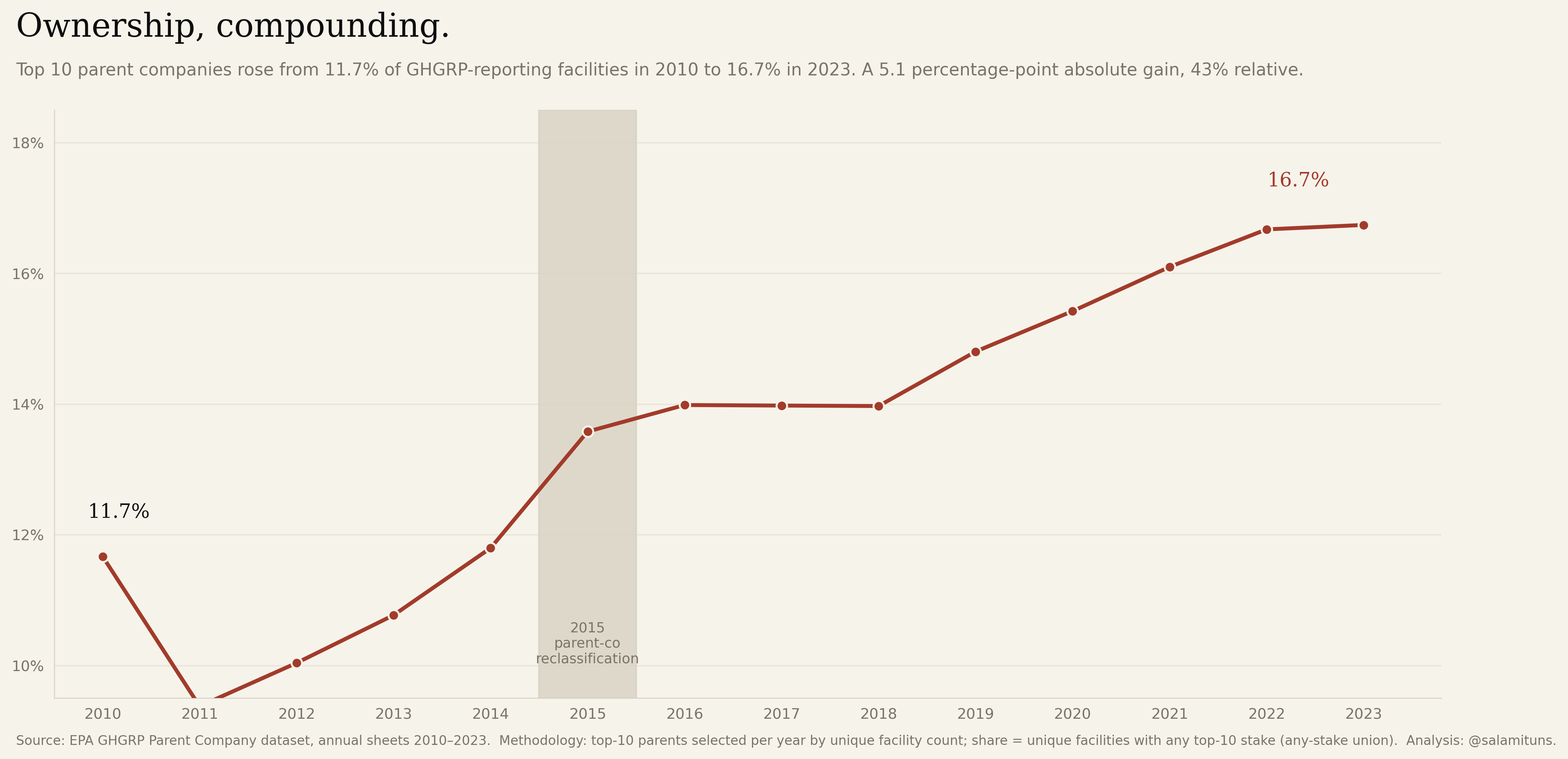
The top ten went from 11.7% to 16.7%.
Top-10 parent share of reporting facilities, 2010–2023, computed under the any-stake union rule. A 43% relative increase. Only 27 companies filed every year across the window.
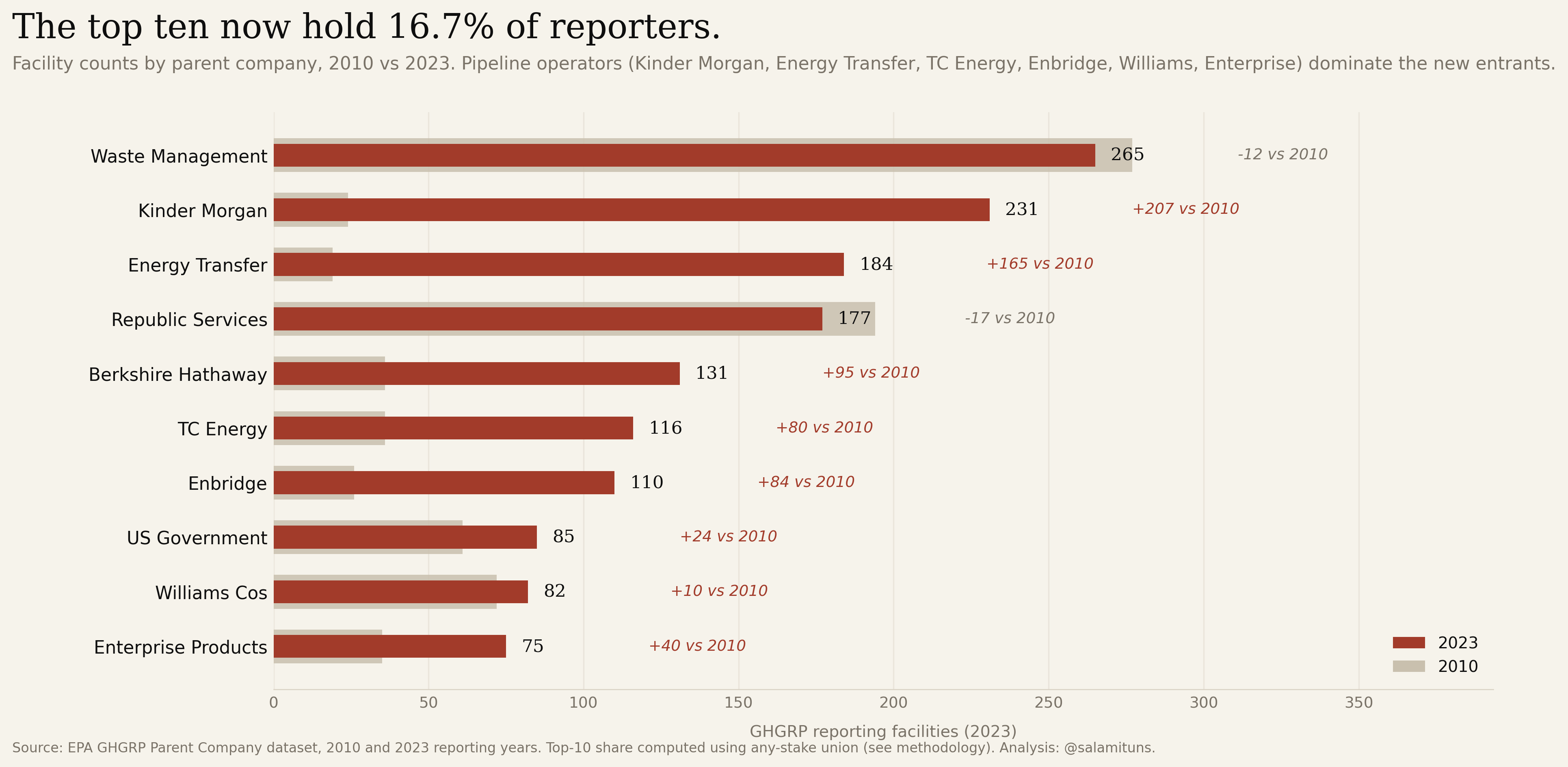
Two parents run 415 facilities.
Kinder Morgan went from 24 facilities in 2010 to 231 in 2023 (+862%). Energy Transfer, 19 to 184 (+868%). The chart ranks the ten largest reporters and their growth since 2010.
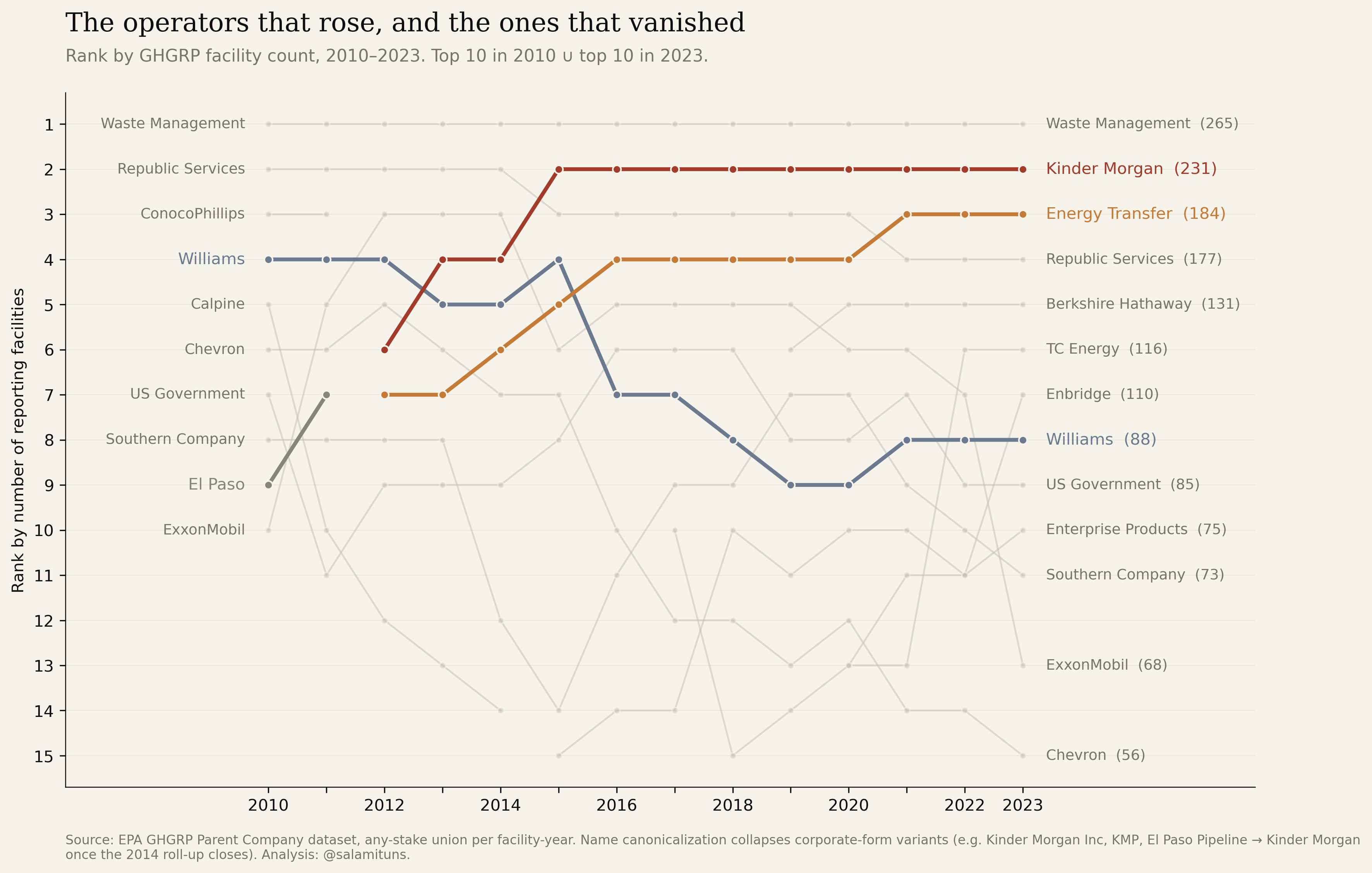
The operators that rose, and the ones that vanished.
Rank by facility count, 2010–2023, for the union of each year’s top ten. Kinder Morgan arrives in 2012 and seizes rank 2 by 2015, the shape of the El Paso roll-up. Energy Transfer takes rank 3 through Regency and Sunoco. Williams falls from fourth to eighth; El Paso disappears entirely. The board reshuffles while the program measures it.
The pipeline corridor, mapped.
Zoomed to the Gulf Coast. Seventeen joint-venture facilities (Florida Gas Transmission, Transco, others) read as the shared backbone of otherwise-separate parents.
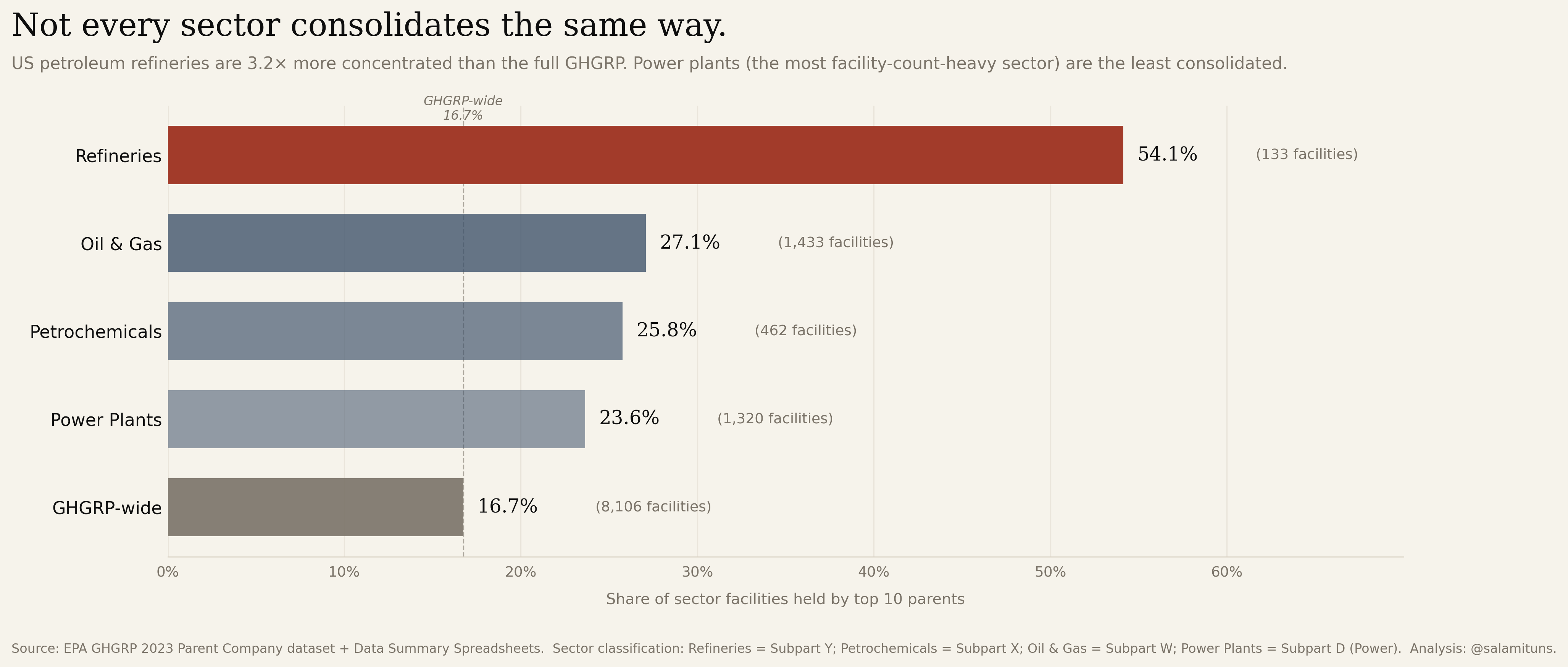
Petroleum refining is the most concentrated sector.
Top-10 parent share of facilities by sector. Refineries sit at 54.1% (3.2× the GHGRP-wide baseline). Oil & gas, petrochemicals, and power plants follow, each consolidated differently.
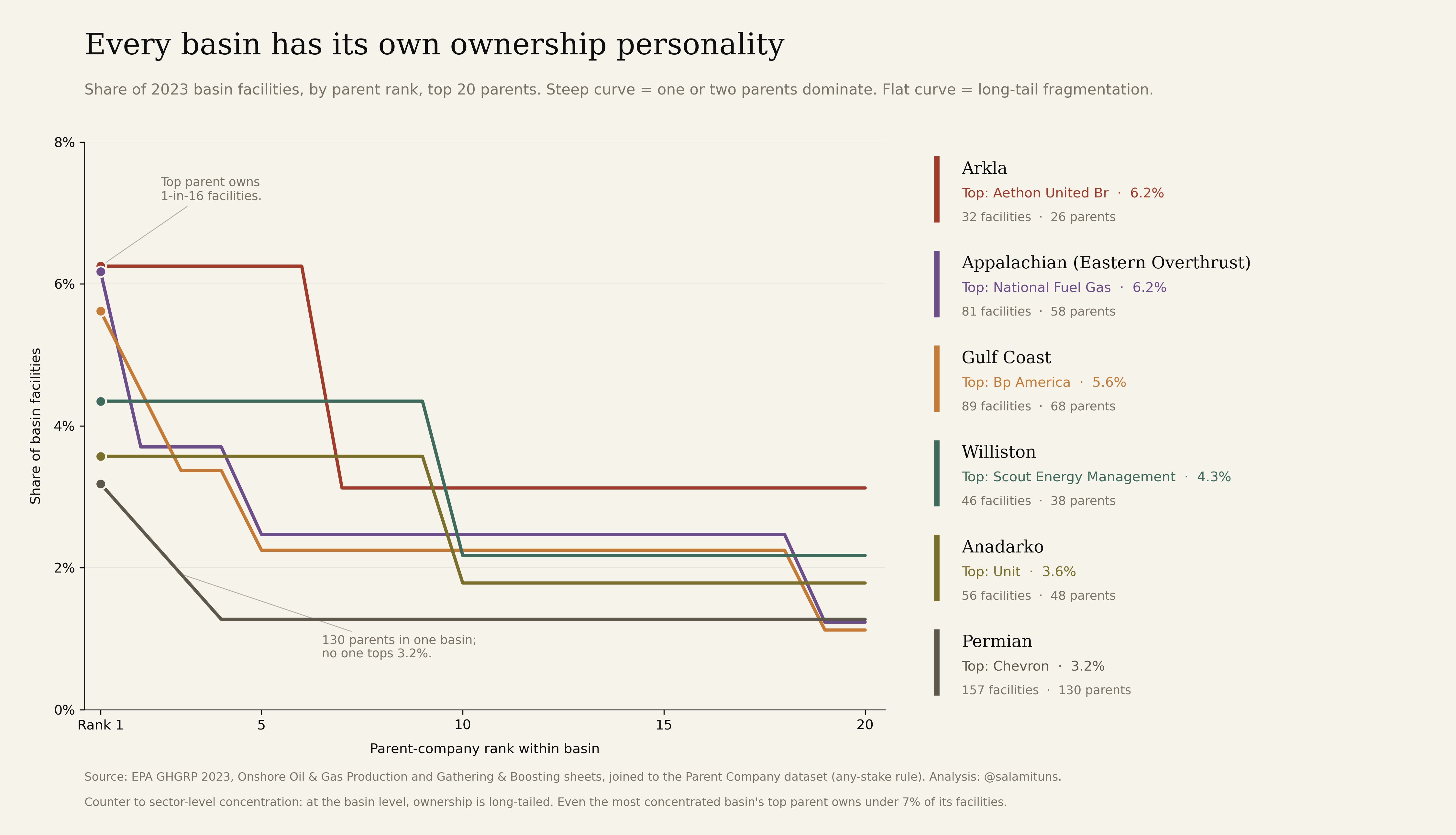
Every major basin tells a different ownership story.
Permian: top-1 = 3.2%. Appalachia: different leader, different curve. Same dataset, different consolidation regimes depending on geology and history.
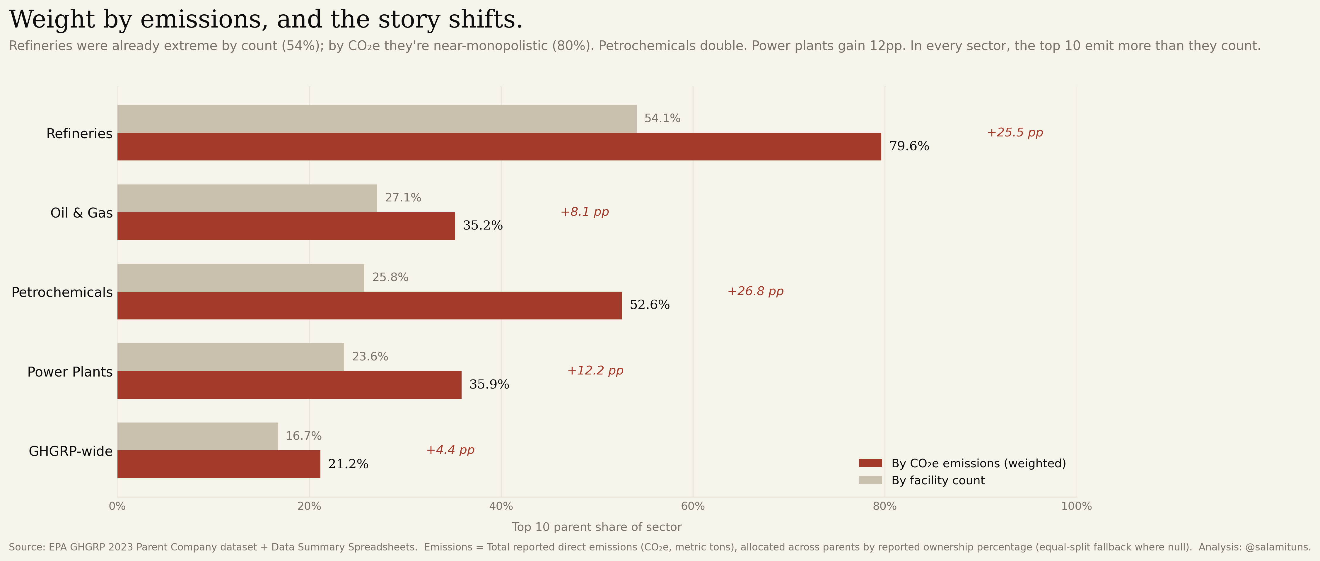
Weight by emissions, and the story shifts.
The same sectors, re-scored by CO₂e instead of facility count. Refineries jump from 54% to 80%. Petrochemicals double. In every sector the top ten emit more than they count. Count-based concentration understates the emissions reality.
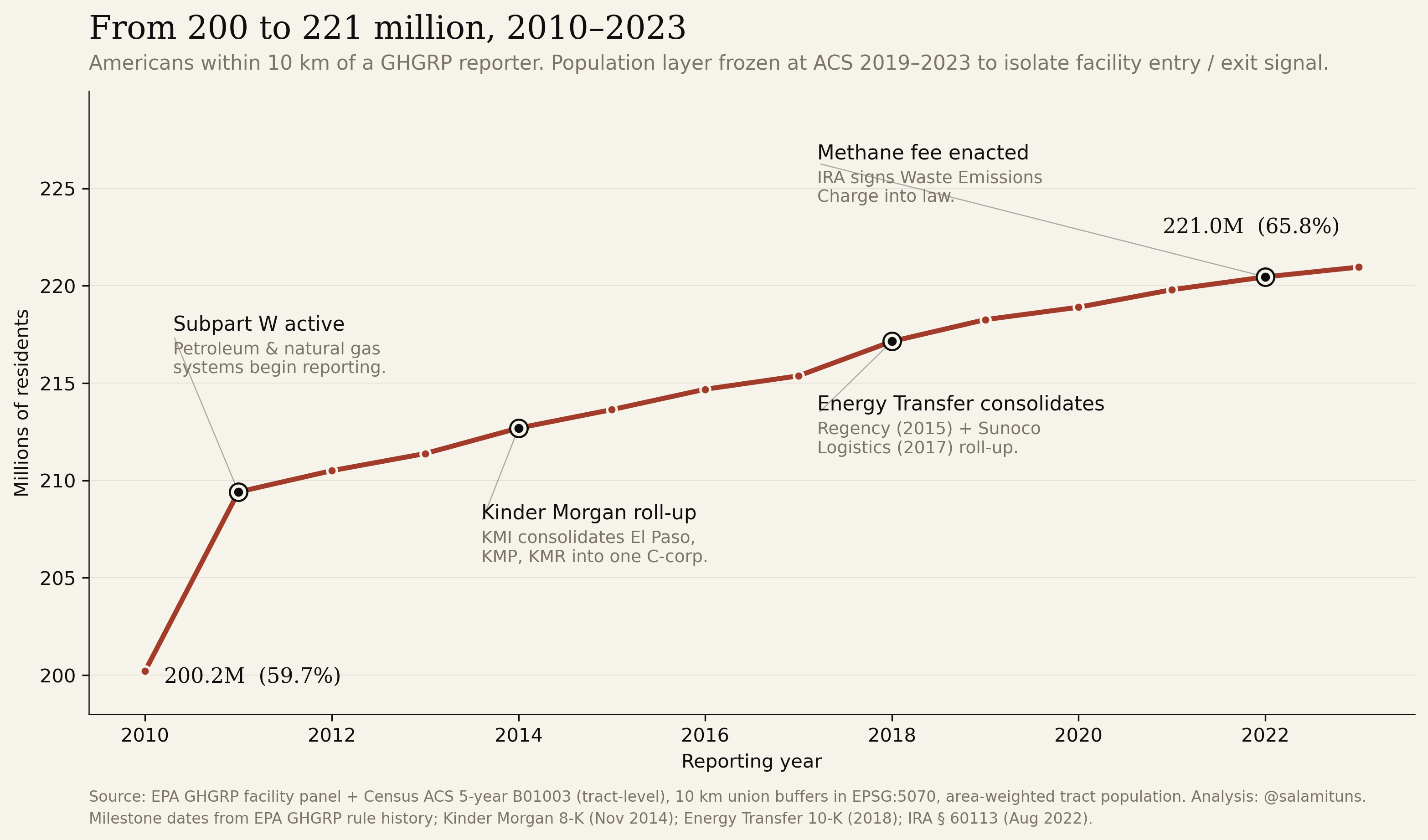
200 million to 221 million, across fourteen years.
Every reporting facility in every year, 2010–2023, with milestones pinned on the curve: Subpart W’s 2011 activation (the 9-million-person jump), Kinder Morgan’s 2014 roll-up of El Paso, Energy Transfer’s 2018 consolidation, and the 2022 Inflation Reduction Act. The population layer is frozen at the 2019–2023 ACS so the curve is a facility-entry signal, not a demographic one.
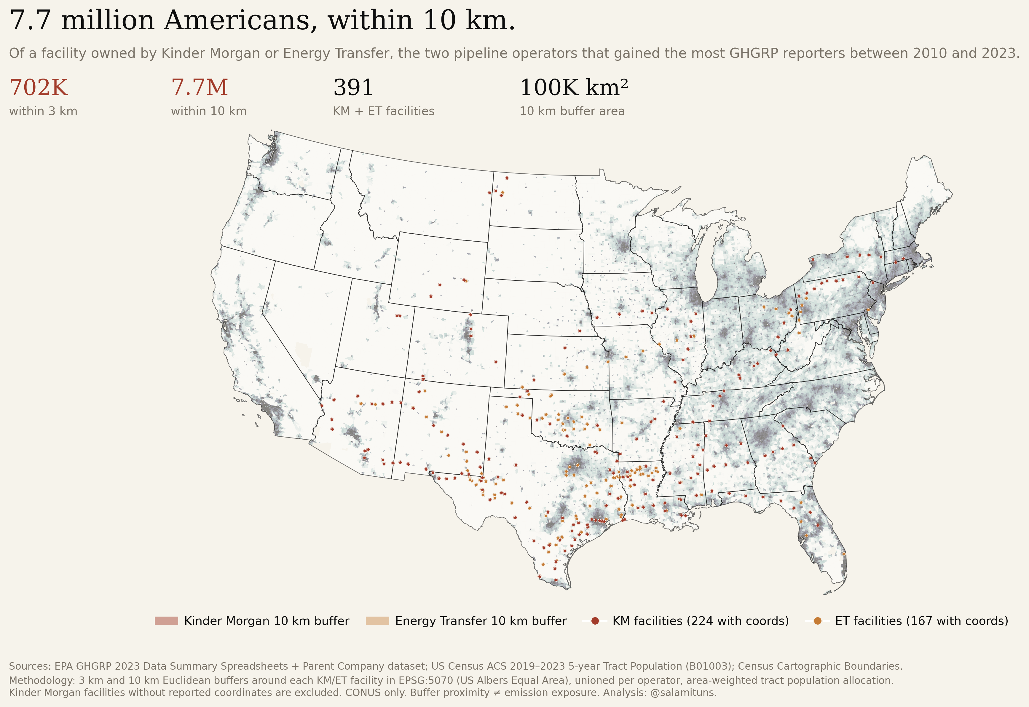
Two parents alone reach 7.7 million neighbors.
Zoom on Kinder Morgan and Energy Transfer in 2023. Census-tract populations area-weighted into 10 km buffers; 702,000 within 3 km. Combined footprint: ~100,000 km², roughly the area of Kentucky. Two companies, the population of Virginia.
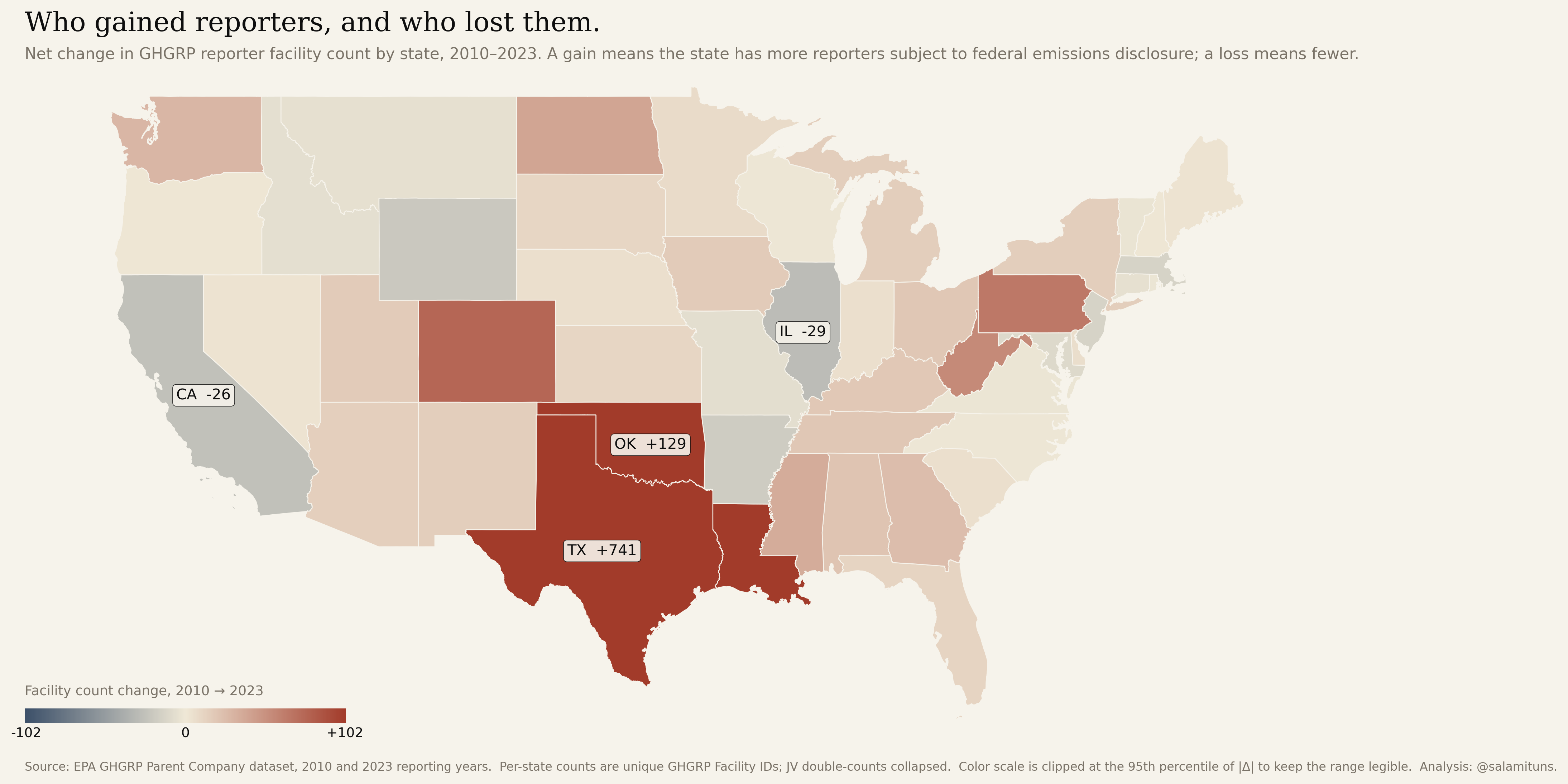
Texas gained 741 reporters. California lost 26.
Net change in facility count per state, 2010–2023. The growth is not spread across the country. It is concentrated in the shale-play and Gulf-petrochemical geography: Texas alone added 741 reporters, Oklahoma 129, Louisiana and Pennsylvania in the high double digits. California, Illinois, and parts of the Northeast lost reporters as older industrial capacity retired without replacement. The national trend in Figure 04 is an average over very different state-level stories.
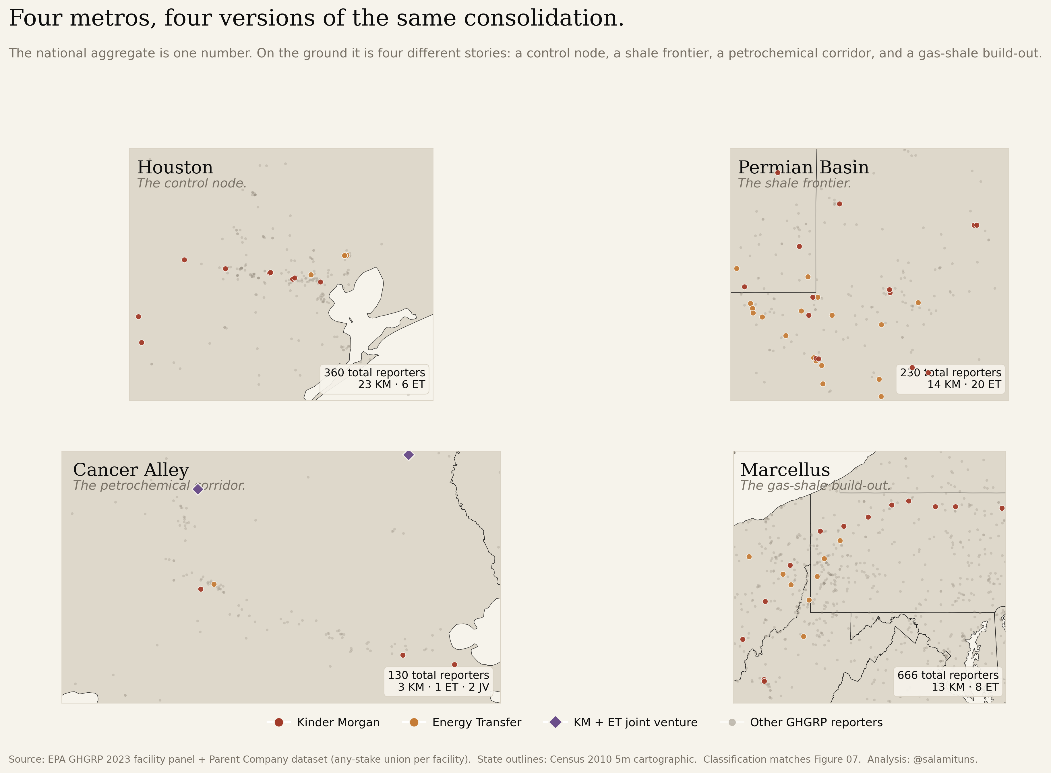
Four metros, four versions of the same consolidation.
Same classification as Figure 07, four regional lenses. Houston: 360 reporters, the corporate control node where pipeline and petrochemical head offices concentrate. The Permian: 230 reporters, where Subpart W added thousands of gas-processing sources and Energy Transfer and Kinder Morgan hold the largest share. Cancer Alley: 130 reporters along the Mississippi River corridor, dominated by petrochemical operators that are not KM or ET. The Marcellus: 666 reporters spread across the Appalachian shale, the single densest region in the dataset and the one where KM/ET’s share is smallest. The national aggregate is one number; on the ground it is four different stories.
We’re debating whether to dismantle the monitoring system while the market it monitors is consolidating into fewer hands.
Context
The GHGRP covers roughly 85% of US industrial greenhouse-gas emissions. Any facility emitting more than 25,000 metric tons of CO₂e per year must file. It is the only federal dataset that ties emissions to named facilities and (through the Parent Company reporting layer) to their ultimate corporate owners. Strip it, and the only federal source of per-facility, per-parent emissions accountability goes with it.
The imperfection critique is real: reporting is self-filed, Scope 3 is out of scope, and methane assumptions have been contested for a decade. But imperfection is an argument for refinement, not dismantling, particularly during a period of accelerating ownership consolidation in the sectors the program measures. Every figure on this page exists because the data exists. What happens next determines whether the next fourteen years are measurable at all.
Data & sources
- Download the CSVs
-
The reconciled files used to produce every figure on this page. Same column definitions as the EPA source; joins and geocoding are pre-applied.
Full pipeline, figure scripts, and intermediate files: github.com/salamituns/salamituns.github.io/ghgrp.
- EPA GHGRP Parent Company Dataset
- Fourteen reporting years, 2010–2023. Facility-to-parent reconciliation with name-variant harmonisation and ownership-share weighting for joint ventures.
- EPA GHGRP 2023 Data Summary
- Facility-level emissions (CO₂e), sector classification, geocoordinates, and unit-level reporting for the latest year.
- US Census Tract & County Boundaries
- 2020 TIGER/Line tract and county polygons with ACS 5-year population estimates, used for the 10 km exposure buffer.
Method
Parent-company reconciliation is the load-bearing step. EPA files facility ownership with name variants (“Kinder Morgan”, “Kinder Morgan Inc.”, “KM CO2 Pipeline LLC”) that collapse to the same ultimate parent. Joint ventures are counted once and weighted by ownership share, so the same facility isn’t double-counted across partners. The 27-company “every year” count is continuous annual presence across all fourteen reporting years, not cumulative mentions.
Concentration metrics are the standard antitrust instruments: top-N share and the Herfindahl-Hirschman Index (HHI = Σs² × 10,000). HHI is reported per sector, not nationally. Refineries don’t substitute for power plants.
Population exposure uses EPSG:5070 (USA Contiguous Albers Equal Area) for accurate distance calculations. Ten-kilometre buffers are drawn around each facility point, unioned across facilities within a year, intersected with Census tract polygons (ACS 5-year, 2019–2023, Table B01003), and area-weighted into the buffer so every tract resident is counted once regardless of overlap. Figure 11 is the full 8,106-facility panel across all fourteen years; Figure 12 is scoped to Kinder Morgan and Energy Transfer; Figure 02 takes the 2023 slice of that panel and re-expresses 65.8% as a tactile thousand-square grid. The population layer is frozen at the 2019–2023 ACS across every year. Tract-level population change is under 20% over the window while facility count grew 55%, so freezing population isolates what changed: facility entry, not demography.
Processing in Python: pandas, geopandas, shapely. Figures are matplotlib at 300 DPI. Maps use CARTO basemaps.